By Monte Enbysk, Microsoft Office Live Small Business
This article is written about us, not by us! Many thanks to Microsoft’s Monte Enbysk for permission to reprint.
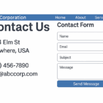
One of the hardest-working but most underrated pages of any Web site is the “Contact Us” page. It hangs in the background, behind more glamorous pages, ready to impart the most basic but essential of information about a business.
“Done right, it’s a pretty modest page, without a lot of marketing or content,” notes Leslie O’Flahavan, a partner at E-WRITE, a Silver Spring, MD-based company that trains and consults about writing for the Web. “But it’s a stalwart page. You put it up, leave it in its place, and let it do its job.”
Some believe that “Contact Us” information can be merged onto other pages of a site. Not O’Flahavan. She argues that even though the Contact Us page should be among the briefest of pages on your site, it deserves its own space and a left-nav or top-of-page link. (Office Live Small Business writer Christopher Elliott lists it No. 1 in his article, “7 pages every business Web site must have.”)
So what makes an effective Contact Us page?
It should, O’Flahavan says, answer two key questions: How people can contact your business and why they should want to contact your business. Here are hers and others’ tips on how to address those questions.
How to contact you
Many small-business owners struggle with how much contact information to share. For example, is a land-line phone number enough or should you include a cell-phone number? What about publishing the street address of your home business? These are decisions each business must make individually, but O’Flahavan says it’s better to be more open than closed: “You can’t really build your business by guarding your location.” Here are specifics.
- Always list a physical address or (snail) mailing address. It’s popular today for businesses to suggest they’re reachable only online—that is, they have an e-mail address and that’s all you need to know. Bad idea, say O’Flahavan and others. Even if you don’t have a store or office where customers visit you directly, there are likely service providers, vendors, and others who should know your physical location. By listing a phone and physical address, you also appear more “legitimate” as a real business.
Beyond that, many people prefer to do business locally and look online for companies in their region, O’Flahavan notes. That can also work against you if you aren’t local. A company based in Vermont, for example, may not get many customers from Texas. Still, the opportunity to secure local customers makes it worthwhile, she says.If you don’t want to list a physical address for security reasons, provide a P.O. box number and hometown where people, if necessary, can snail-mail items.
- List all appropriate phone numbers. At the very least, list your business phone and a fax number. Consider including any alternate business numbers (such as for departments), and a cell-phone number if you feel comfortable doing so. Also, mention where and how someone can leave a voice-mail message for you after hours. Not listing a phone number at all suggests you’re understaffed or not customer-friendly.
- List at least one e-mail address that is checked regularly. You may get spam. But e-mail communication is a business requirement today, and is a convenient way for customers to reach your business after hours. O’Flahavan recommends having your e-mail address be “hot,” so that users can instantly open the link in their own e-mail programs to send you a message. Creating an e-mail link is similar to creating a URL link; simply replace “http://www.yourbusiness.com” with “mailto:johndoe@yourbusiness.com.”
- Use an embedded e-mail submission form if necessary. Web site e-mail forms can be ponderous, particularly if one simply needs to ask a question. “They put up a suspicion that my e-mail is going to be stored,” O’Flahavan adds. But she concedes a form may be necessary if your company needs information for taking product orders, or collects subscriber information for newsletters or white papers.
In a MarketingSherpa article, “How to Build an Astounding ‘Contact Us’ Page: 7 Customer Service Tips From Unilever,” Linnea Johnson, director of consumer services for Unilever, argues that an e-mail submission form is better than merely providing your contact e-mail address. “The latter can result in multiple messages and wasted time,” she writes. For businesses receiving high volumes of e-mail, she may be right. If you plan to retain the customer information, Johnson advises that your form require users to provide their full name, mailing address, e-mail address, and age—the latter so you know if you are dealing with kids, in which case you cannot legally retain their information. If you retain customer info, you also need a privacy policy that you can display to customers.
- Include a photo of your business and/or directions. These are much less important if you don’t have a store or a reason for customers to visit. Even so, directions are worthwhile if service providers and vendors are likely to need them, O’Flahavan says. If your business depends on getting people to visit, you may want to consider a separate “Directions” page. A picture of your signage or storefront may help some people find you more easily.
- If relevant, link to your blog or social networking sites. “Contact Us” means being reachable through Web 2.0 channels too, O’Flahavan says. If you write a blog related to your business, or have a LinkedIn or Facebook page that you’d like to expose to customers and prospects, include links to them. But make sure the fit is right, or your customers may become confused. For example, if your business sells handmade chocolates but your blog is about hiking, you probably should omit the link.
- List events you attend or promote. If you are active in organizations or causes related to your business, and would like to meet customers through them, list information and links about the upcoming events along with your role. This is a smart way to market yourself and your business, O’Flahavan says. The downside: Your Contact Us page will require more frequent upkeep. Many business owners prefer a static Contact Us page.
Why people should contact you
In subtle ways, guide people on why they should contact you, without a lot of verbiage.
- Offer simple instructions on using your contact information. Example: “Please call us or e-mail us to order handmade chocolates, or visit our store to taste free samples.” Another: “Call us for a free quote or visit our office for a free consultation.”
- Provide related page links for more information. Where appropriate, include links to your products or services pages, customer service or technical support, your newsletter sign-up page, and/or your FAQ page. Example: “To learn more about industry news and trends, sign up for our monthly newsletter.” “You can do a little bit of marketing on Contact Us, but not too much,” O’Flahavan says. “Doing a lot of marketing on this page comes across as cheesy. So don’t drift too far.”
Additional tips
- Use images only if they add editorial value. A photo of your staff or your storefront may add warmth and personality, as well as help customers locate your business. But clip art of a telephone or a mailbox adds no value. “The art should support the message of the page,” O’Flahavan says, adding, “and the message of the page should be, ‘We’re easy to contact and worth contacting.'”
- Make it easy to find and skim. List your Contact Us page prominently in your site navigation, and design it with minimal text and excellent organization. Text should be in a sans serif font, with phone numbers and addresses set off and easily distinguishable from other text. The contrast on the page should be high, preferably black text on a white background.
Ready to publish? Then put it up and let the page do its job.
This article is reprinted with permission from Microsoft Office Live Small Business.


0 Comments