[This article was originally published by ICMI.]
I wish FAQs were the 8-track players of customer self-service, but they are not. Lots of companies still publish FAQs pages and lots of desperate customers go to those pages for help. And though I usually avoid sweeping generalizations, I’m confident about this one: most FAQs pages stink. They’re poorly organized, hastily written, and neglected by the people who should maintain them. The UX community–professional connoisseurs of worthwhile content–has avidly hated FAQs for years, and for good reason. Just look at these UX article titles:
- What the FAQ? Why FAQs Provide a Poor User Experience
- Why FAQ Pages Are Almost Always a Bad Idea
- Why Do You Still Have FAQs for Your Website?
One of my recent projects has been to help a 25-branch community bank update its customer-facing knowledge base. So, lately, I’ve been looking at a lot of banking content, including FAQs. It’s ugly out there, my friends. So many dusty, crusty, hard-to-use FAQs pages. So many thieves of customer effort!
Here’s my “What Not To Do With FAQs” list. These are banking examples, but let them be a warning to you, even if you don’t work for a bank!
1. Don’t call your stale, chaotic collection of FAQs a “knowledge base.” A knowledge base is a digital library of self-service information. Customers expect to search a knowledge base by keyword, product name, or task, etc. Your FAQs aren’t searchable like that. And definitely do not call your FAQ both a knowledge base and an FAQ like this bank does.
2. Don’t bail on your responsibility to organize your FAQs. Hopefully, you’ve sorted your FAQs into logical groups and given each group a name your customers will find intuitive and useful. Don’t give the groups empty names like “General Information” or “Alerts & Notifications & Miscellaneous” like this bank does.
3. Never label a category of FAQs “Information” like this bank does. I mean, which FAQ could not be placed into a category named “Information”? If any and every FAQ could go into a category, the category name isn’t helpful.
4. Don’t present a long, long un-categorized list of FAQs like this bank does. You don’t hate your customers, so why would you make them work this hard to find the answers they need?
5. Don’t refer to the answer in another FAQ without linking to it like this bank did in an FAQ about its mobile app. Linking to related FAQs is one way to reduce the extra effort FAQs extract from customers. If you can provide a helpful or related hyperlink, do it!
6. Don’t let Marketing use space in your Customer Support FAQs to pose and answer fakey questions they wish customers would ask like this bank does. Their FAQs include the question “Are bank CDs worth it?” Of course, a bank will answer “yes” to that question, so is it a real customer question?
7. Don’t fail to proofread your FAQs. They’re already a lot of work for customers, so don’t also let your FAQs contain spelling, punctuation, or grammar mistakes. This bank published the FAQ “Is 2FA be required for all users?” That’s embarrassing. Just tell ChatGPT to find the problems on your FAQs page, so you can fix them. Copy and paste this prompt into ChatGPT and see for yourself: “Proofread the web content at https://www.signaturebankna.com/knowledge-base. Find and mark any spelling, punctuation, or grammar mistakes.” When I used this prompt, ChatGPT found the “be required” mistake and 12 others. (Quick note about using this prompt with the unpredictable tool that is ChatGPT. I got slightly different answers each time I used the prompt. There’s AI for you.)
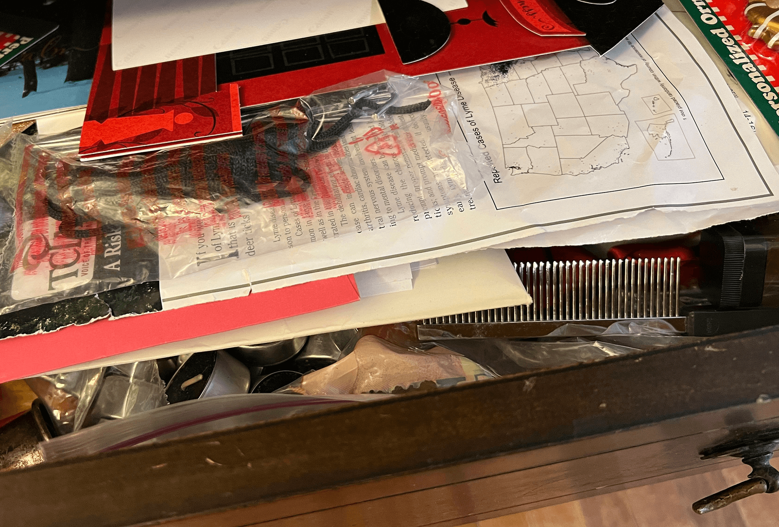
The only way to have a useful FAQs page is to be real with yourself and your org about how much time and effort goes into maintaining it. Your FAQs page wants to turn into a shambolic junk drawer, a dark space crowded with sharp objects. But you can have a useful FAQs page if you devote the same amount and types of energy to it that you’d devote to the articles in an actual knowledge base. That’s the question right there. Will you maintain your FAQs page–with its loooong scrollable list of questions, its accordions, its dropdowns–or will it just age gracelessly and frustrate customers? It’s up to you.
Photo by Patrick Donnelly on Unsplash


0 Comments