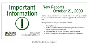
This strident pop-up from my bank (note the huge exclamation point) has a simple message: Sandy Spring Bank is improving my ebiz reports. I’m happy. And they’ve provided me a nice little bulleted list of the four ways the new reports will be better than the old ones.
Now, most web users like to click buttons. When I’m offered a”Tell Me More” or a “Remind Me Later” button, I’m as likely to click as the next guy or gal. But don’t invite me to do something when there’s really nothing for me to do. [Click the screen shot to see it full-size.]
Instead of helping me dig deeper, these buttons raise all kinds of confusion in my mind:
- You offer to tell me more, but what more is there for you to tell me, Sandy Spring? I only want you to tell me more about the new reports if I have to take action in order to get them. Do I need to do something? If so, why aren’t you telling me now?
- Remind me later? To do what? Again, if I need to do something, tell me now.
This pop-up begins by illuminating a new offering, but it ends by confusing me. And while I might forgive another site for an action button content glitch, I hold my bank to a higher standard. I’m banking online these days, and I want to be quite sure that my bank is solid, responsible, and credible. So I’ve got to say that these go-nowhere buttons—combined with the error-laden first sentence—are causing me to have a big question mark (not a green exclamation point) about my bank.
— Leslie O’Flahavan
Tags: Content, Usability


0 Comments