Dear U.S. Securities and Exchange Commission,
Usually I comment on the quality of the writing at a web site, but I’ve got to talk to you frankly today. The text on your home page is hurting my eyes:
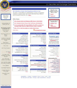
- Your masthead is right-aligned
- Your left column is centered
- The labels for the main sections of your site are left-aligned (white text on a blue band) but each item listed below is right-aligned, which leaves a ragged blank mess on the left
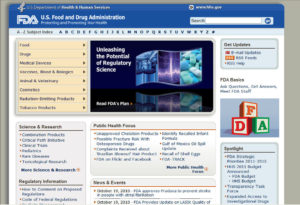
SEC, I don’t know where to look. My eyes are hopping around everywhere; I am conducting a very unproductive experiment in scanning. Maybe you could make your page look more like the Food and Drug Administration’s home page. The FDA’s isn’t perfect, but the text is left-aligned.
SEC, please bone up on the usability research on text alignment. For homework, you must read:
- Right-Justified Navigation Menus Impede Scannability by Jakob Nielsen
- Eye Gaze Patterns while Searching vs. Browsing a Website from Usability News
And, SEC, whatever you do, please do not use the HR Management home page as your model. The only thing worse than text with hard-to-scan alignment is text that moves.
— Leslie O’Flahavan
Tags: Government web writing, Usability, Visual display


0 Comments